My Retro Site: A Nostalgic Old-Web Experiment
“Welcome to my homepage. You are visitor #000047.”
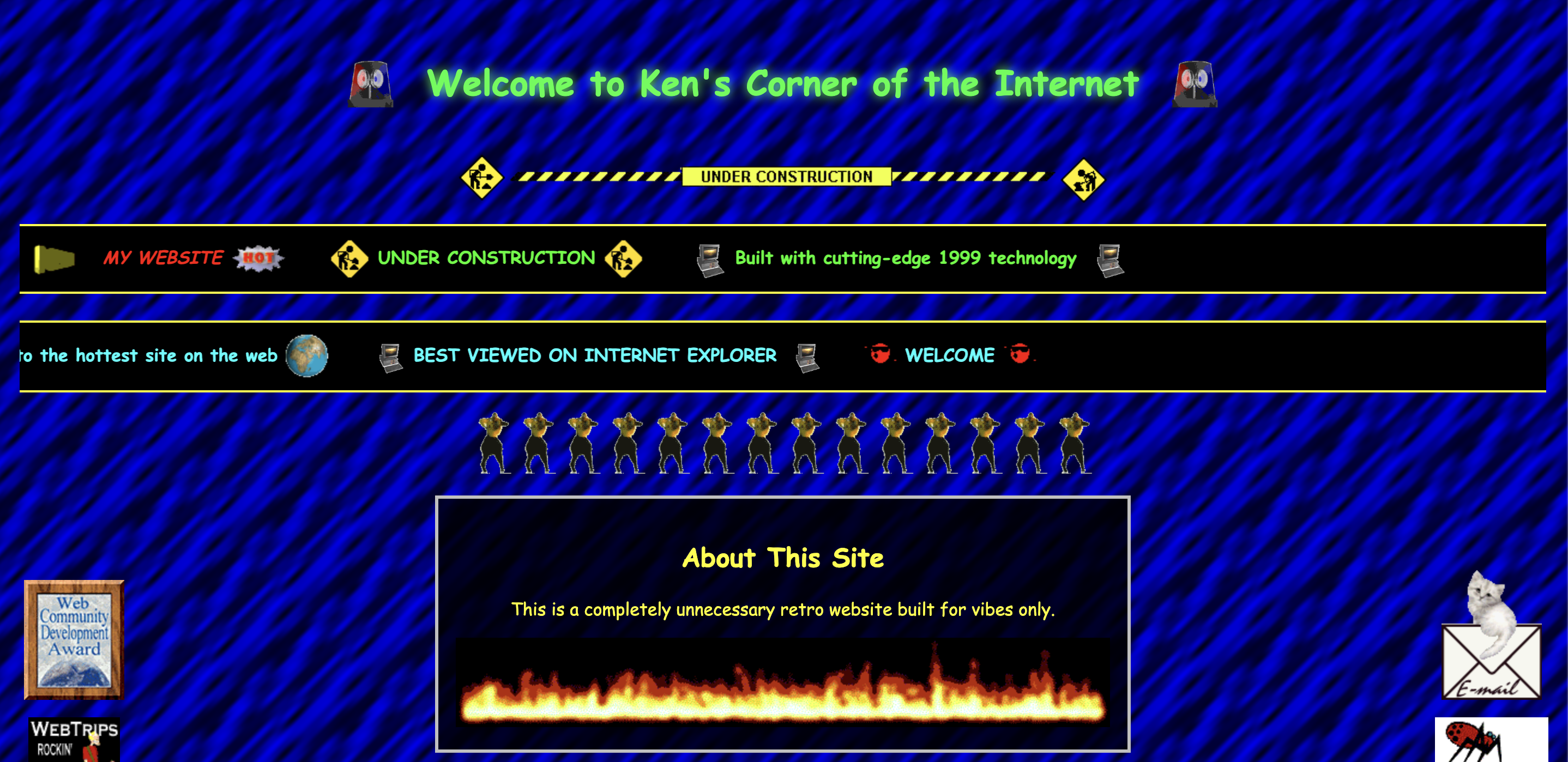
My Retro Site is a small microsite on its own subdomain built to recreate the feel of old GeoCities-style personal websites. It leans all the way into tiled GIF backgrounds, stacked marquee banners, under construction graphics, loud colors, and the kind of visual chaos that made the early web feel fun and personal.
Why I Built This
Modern websites tend to be clean, polished, and minimal. That is usually the right move. But sometimes it is fun to go in the complete opposite direction.
I built this because I wanted to make something small, weird, and memorable. It was a chance to revisit that old-web energy and make something with a lot more personality than polish. The whole point was to embrace the tackiness on purpose and make it feel intentional instead of random.
It is definitely unserious, but that was also part of the fun. There is still real thought behind the layout, the assets, and the interactions. The challenge was not making it look good in the traditional sense. The challenge was making it look gloriously bad in the right way.
Current Features
The microsite lives on its own dedicated subdomain and is the full retro experience. The repeating tiled background sets the tone right away, and from there it just keeps piling on with marquees, animated GIFs, content panels, and side rails full of visual nonsense.
There are custom retro content sections, link blocks, and a bunch of intentionally loud styling choices that somehow still hold together enough to be usable. That balance was a big part of the project. I wanted it to feel chaotic, but not actually painful to use.
I also added a companion redirect CTA on my business card site that bounces around the screen like an old DVD logo and sends people over to the retro microsite. It is silly, a little obnoxious, and honestly perfect for the bit.
 The companion redirect experience that playfully routes visitors from the main site to the retro microsite
Technical Highlights
The site is a lightweight static build using plain HTML, CSS, and the smallest amount of JavaScript. No framework, no unnecessary complexity, no real reason to overbuild it. That felt like the right fit for a project like this.
A lot of the actual work came down to asset selection and restraint, which is funny considering how chaotic the final result looks. I had to be selective about which GIFs to use, how to structure the sections, and how far to push the page before it stopped being fun and started feeling broken.
The floating redirect CTA on the main site has hover-to-pause behavior and click-through navigation to the retro subdomain. It is a small touch, but it helps sell the whole idea and makes the transition feel more intentional.
Everything is deployed on Vercel, which is extremely overpowered for a site this ridiculous, but that also makes it funnier.
Future Enhancements
There is still a lot of room to make this worse in the best way possible. A fake guestbook and visitor counter feel like the obvious next steps. I would also like to add more retro badges, buttons, fake webring links, and maybe a few hidden easter eggs for people who click around.
There is definitely more nonsense I can add here, and that is part of the appeal.
This project is basically a love letter to a messier and more expressive era of the web. It is a reminder that personal sites do not always need to be polished or serious. Sometimes they can just be weird, funny, and fun.